Design with intent
Type scale, spacing, and a semantic color system — decisions made on purpose, not by default. I design in Figma and in code, so what I draw is always buildable.
A senior frontend engineer who also designs. Six years building production web apps full-stack with Next.js, TypeScript and React — SaaS dashboards, recruitment tooling, data-dense consoles. I own the design decisions and the code that ships them, front to back. One person, both sides of the screen, no handoff.
Most teams split the work: a designer hands a mockup to a developer, and something is lost in the gap. I close that gap — I make the design decisions and write the production code, so the thing you ship is the thing that was imagined.
Type scale, spacing, and a semantic color system — decisions made on purpose, not by default. I design in Figma and in code, so what I draw is always buildable.
Six years of React, TypeScript and Next.js on real products — full-stack when it's needed: auth, billing, APIs, dashboards. Tested, accessible, and tuned so it feels fast.
From a maintainable design system to the calm of a data-dense console. I decide what deserves polish now and what ships good-enough, and I make the call.
The concrete things I get asked to build — and the parts of the modern frontend role that decide whether a product feels considered or generic.
Tokens, primitives, and documentation a whole team can build on without the UI drifting.
Admin panels, analytics, candidate pipelines — high-volume screens made calm and fast to scan.
Charts a user trusts at a glance, on a semantic color system — honest, not just decorative.
Profiled, trimmed bundles and interactions tuned to feel instant. Core Web Vitals as a target, not luck.
Keyboard paths, contrast, and semantics handled as a baseline — WCAG, not an afterthought.
Cursor and Claude to move fast — every pixel and line still reviewed and owned by me.
Four products where I owned both sides. For each, the part I'd most want to talk through with you.
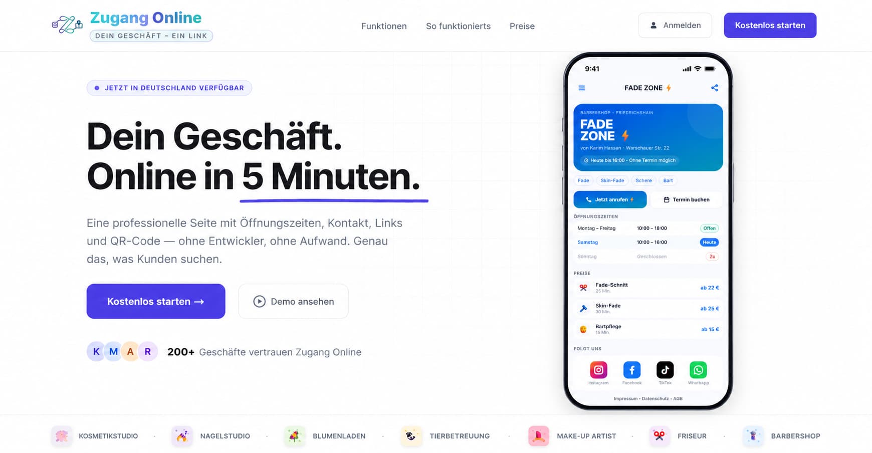
A digital-presence platform for German local businesses — cafés, salons, studios. I designed the brand and a full design system, then built the product: 7 business-type templates, a draft-and-publish editor, billing, analytics, and a mobile-first business page customers actually want to use.
The booking flow needed legal consent, and the default answer was a mandatory checkbox in front of the button — which kills bookings and reads as distrust. I made the case the data was covered another way, removed the checkbox, and replaced it with a quiet plain-language notice: compliant, and invisible to the user's momentum.
Next.js · TypeScript · Tailwind · Supabase · Stripe · Figma
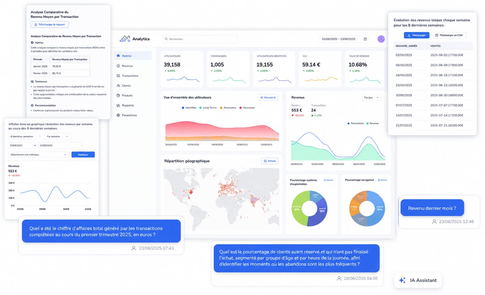
As Lead Frontend Engineer I owned the product UI of an AI-powered analytics platform — stat cards, revenue and user charts, a geographic view, and an AI assistant that answers questions about the data. I built the shared component system and the CI gates that let a small team move fast without the interface fraying.
An analytics console drowns easily — every metric wants to be a chart. I held a strict visual hierarchy: headline stats first, supporting charts on one semantic colour system, and an AI summary so a user gets the answer before they read a single axis. Calm over busy.
React · TypeScript · Charts · Component system · CI/CD
Frontend for a recruitment SaaS — the job-board and candidate experience. Search and filtering across agencies, contract types and locations; dense job-listing cards with salary, mode and experience at a glance. The same problem space as a modern applicant-tracking and hiring platform.
A candidate scans dozens of listings fast; each card has to carry contract, location, salary, tags and date without becoming noise. I built a strict card hierarchy and an icon-led metadata column so the eye lands on what matters first — density that stays scannable.
React · TypeScript · Data-dense UI · Search & filter UX

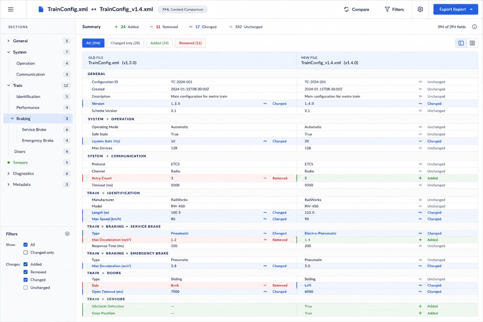
At Alstom I built a tool that compares the content of two railway-configuration XML files — rendered as readable field-and-value sections, old version beside new, not raw code. Hundreds of safety-critical parameters where a misread value is not a cosmetic bug. The job was to make a wall of structured change read as calm, honest, and scannable at a glance.
Colour alone lies — it fails a colour-blind reviewer and implies a severity the tool can't judge. Every changed row carries the meaning three ways at once: a coloured border, a shape icon (+ / − / ~), and a text status, with the old and new values shown side by side. Honest data design over pretty data design.
React · TypeScript · Data-dense UI · Accessibility
The same person carries it the whole way — which is exactly why nothing gets lost in translation.
Talk to the people who'll use it. Turn a vague "make this nicer" into a concrete plan and the one job the screen has to do.
Wireframe, then shape it in Figma and in code together — so the design is grounded in what the data and the stack can actually do.
Ship it as production React: components, accessibility, tests, and the 200ms of polish nobody else notices.
Watch real usage, trust the data over my own taste, and change my mind when it disagrees. Then iterate.
I use AI tools aggressively to move faster — but I own every pixel and every line that lands. I can tell when a generated layout is generic, and I turn it into something with a point of view.
— how I think about design and the tools around it
I'm open to design engineer roles where I can own the surface end to end. If that sounds like your team, say hello.